
LEAVE A REQUEST
Just type your contacts
I agree to the Z&G.Branding Privacy Policy
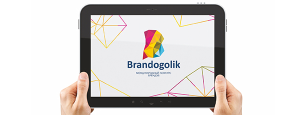
International brands' competition
Rewards:
Logolounge TOP 50
Red Apple shortlist
Rewards:
Logolounge TOP 50
Red Apple shortlist
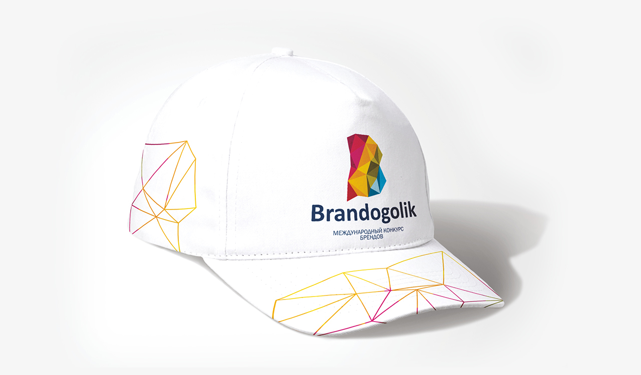
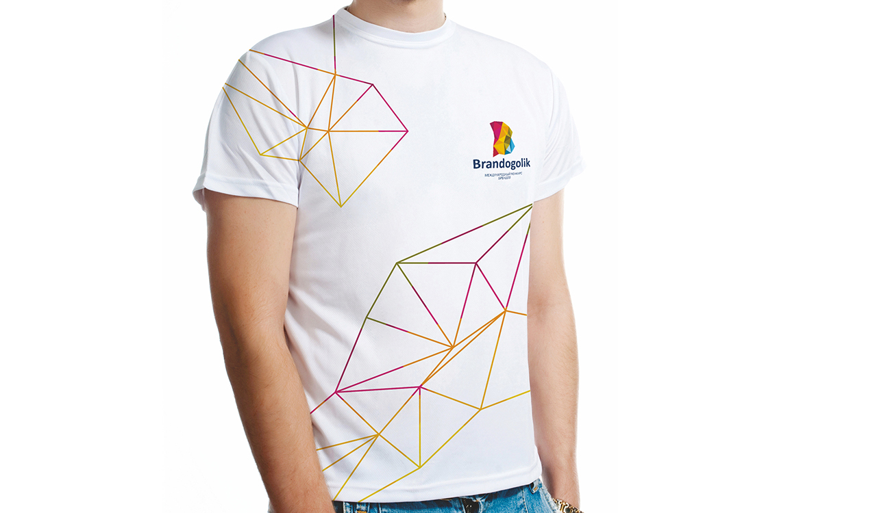
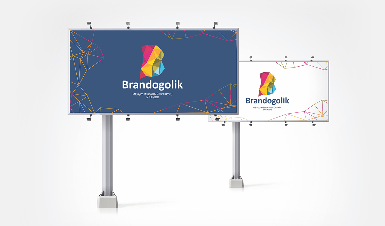
The brand identity for the competition should be bold and trending, setting the bar for the entire industry.
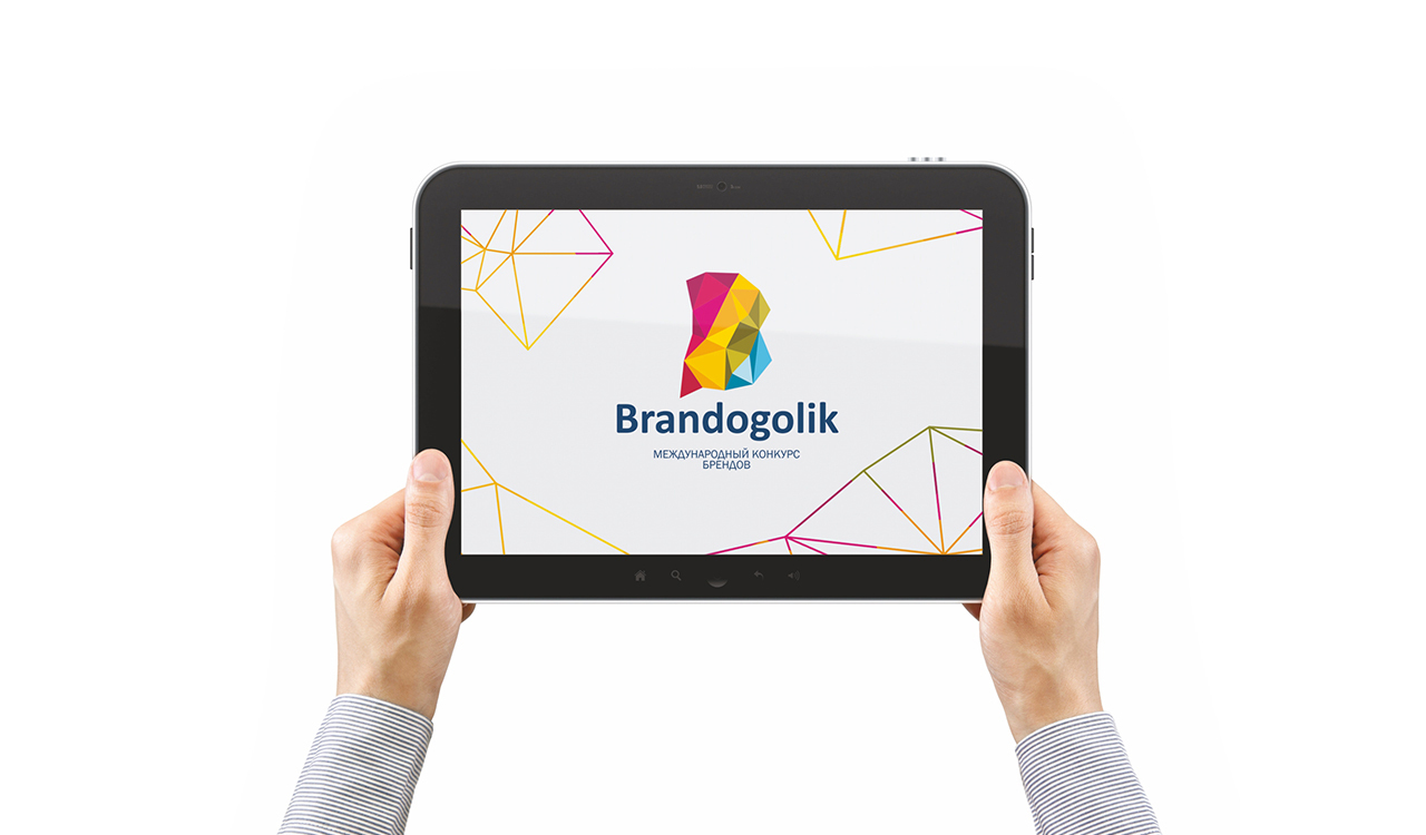
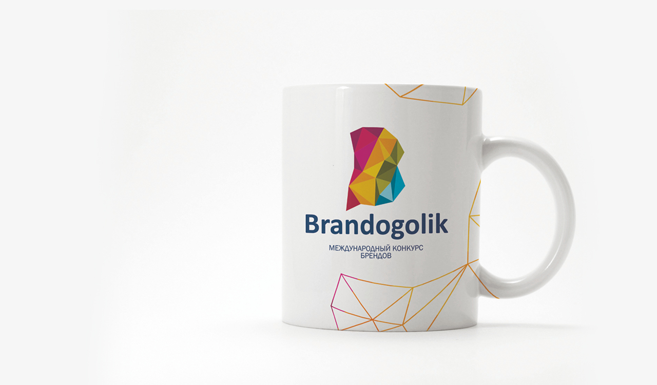
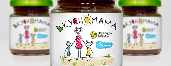
The name "Brandogolik" is ironic about the obsession with brands in the modern world. Bold combination of colors and cubism style. The contest logo uses the most interesting trends of that year.
The logo is a bright and multi-faceted letter "B" - it hides everything at once: different industries, different brands, and different consumer emotions. The tail of the letter "B" represents direct speech, direct dialogue between the brand and the consumer.
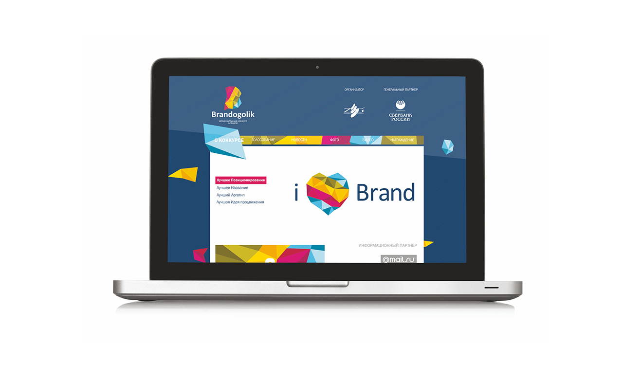
The contest logo was intended, first of all, to become a symbol that would be associated with positive emotions of consumers. And it succeeded. Bright and сatchy logo became the Agency's business card for a long time.


Segments
Services
All
IT
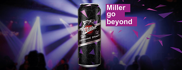
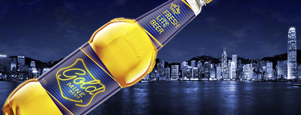
Low-alcohol
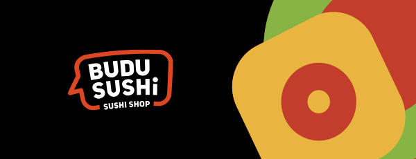
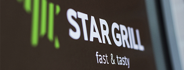
HoReCa
Industry
All
Branding
Marketing
Digital
Packaging


LEAVE A REQUEST
Just type your contacts
I agree to the Z&G.Branding Privacy Policy
We are open for partnership
Сontact us to get free online appointment.
Сontact us to get free online appointment.


Cities: Ekaterinburg, Moscow, Dusseldorf, San Francisco, London