
LEAVE A REQUEST
Just type your contacts
I agree to the Z&G.Branding Privacy Policy
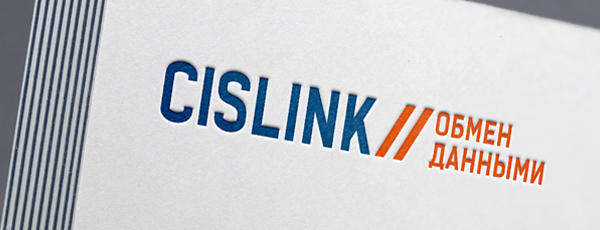
The identity of the IT platform for the B2B sector should give the impression of a reliable and professional company. A partner company whose product won't let you down. A modern and technological solution that allows you to quickly solve problems arising in business. Cislink has just such products, our task is to convey these values to the target audience by visual means.
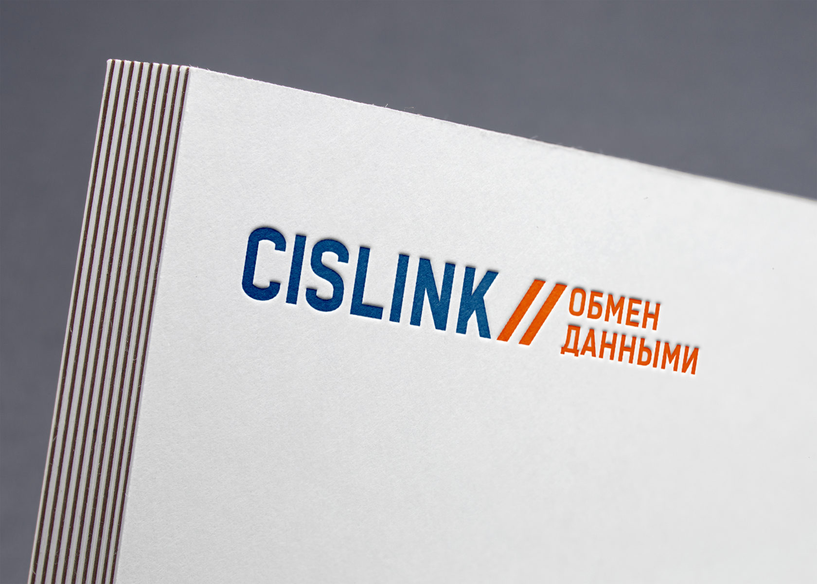
Since Cislink's area of expertise is data exchange, the logo should also state this right away. In it is based on the sign of the double slash — //. A symbol that we use when specifying network addresses, which immediately refers to the scope of Cislink's business. Data exchange. The symbol is clear to people, even not the most advanced user of the network, it is easy to read by absolutely everyone.
The main colors are blue, which is used for writing the name, and red – for the descriptor. Blue indicates the reliability of the solutions provided, while red highlights the lightning speed of data exchange. Which is extremely important for Cislink customers.
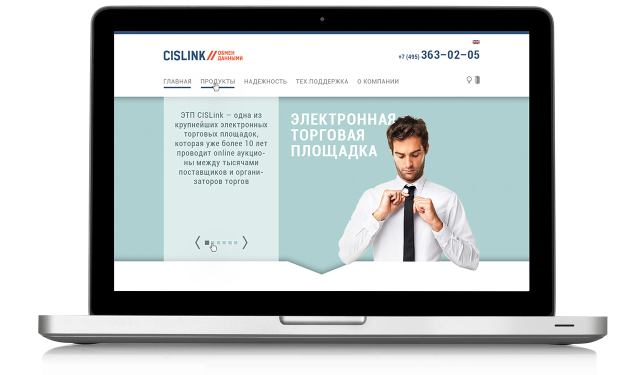
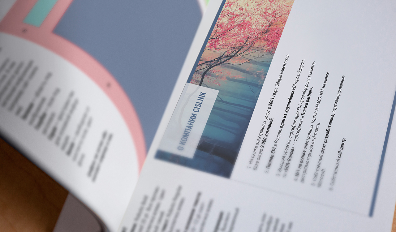
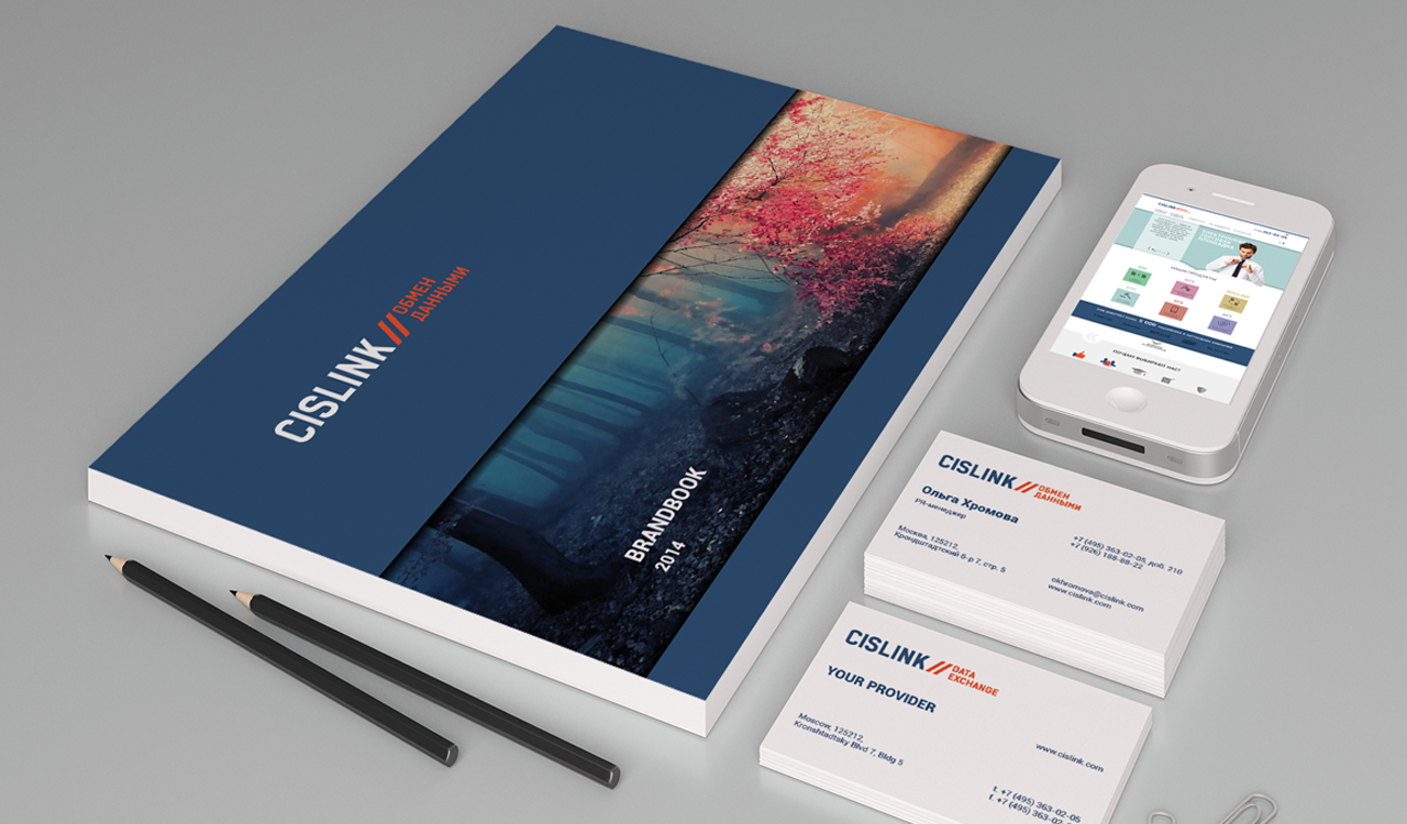
To fix the visual constants of the brand, we developed a brand book that contains rules for the design of the main corporate identity carriers. The website design was also developed based on the corporate identity.


Segments
Services
All
IT
Low-alcohol
HoReCa
Industry
All
Branding
Marketing
Digital
Packaging


LEAVE A REQUEST
Just type your contacts
I agree to the Z&G.Branding Privacy Policy
We are open for partnership
Сontact us to get free online appointment.
Сontact us to get free online appointment.


Cities: Ekaterinburg, Moscow, Dusseldorf, San Francisco, London