LEAVE A REQUEST
Just type your contacts
I agree to the Z&G.Branding Privacy Policy
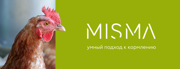
Supplier of natural feed additive for animals in Russia and CIS countries
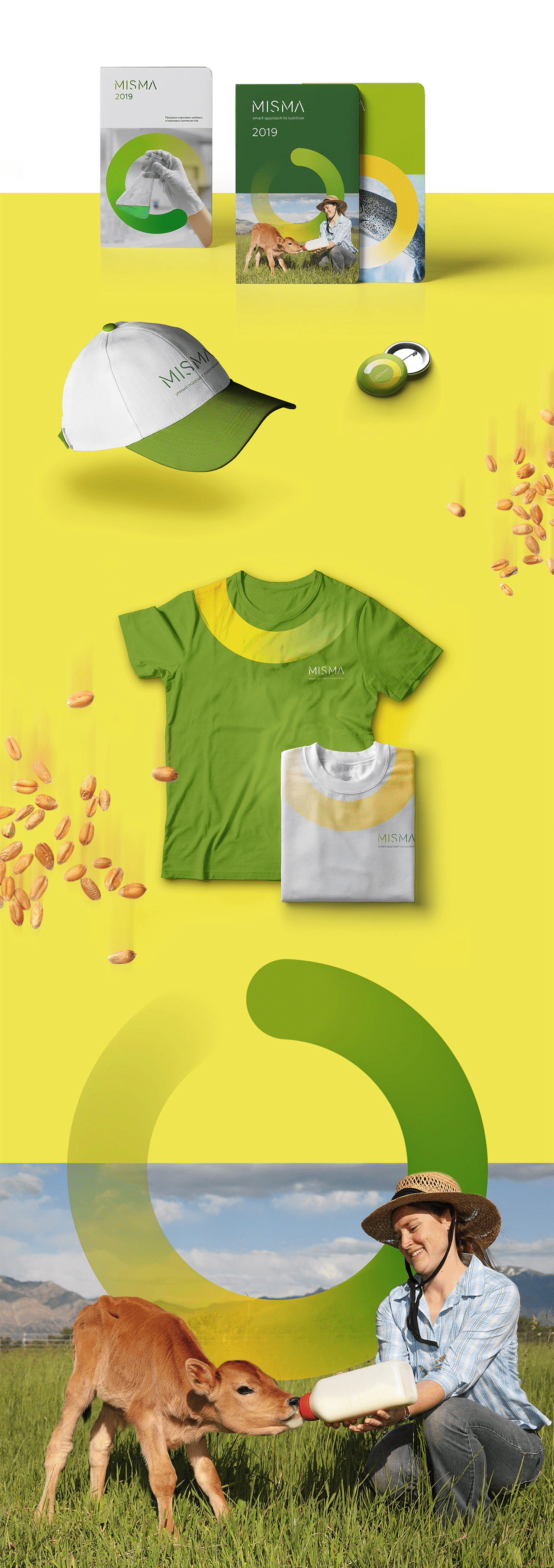
Competition has increased in the premix market. And it was vital to Misma to share, creating an image of modern, innovative company with real experts in their own area. Competent rebranding can solve such a problem.
The growth of an animal is a process in which there are no nuances. Feed additives are present in it invisibly, gradually appearing, they become an integral part of the finished product. So the Misma logo appears, showing the contribution of feed additives to the growth of the animal.
The graphic element in the form of an open circle becomes a metaphor for the care that surrounds the animal when using Misma supplements. Pure natural colors indicate the naturalness of the product.
The light, modern font solution shows the company's innovation and strict scientific approach to feeds. The resulting identity sets the company apart from its competitors, creating the image of an advanced technology company, a true market leader.


Segments
Services
All
IT
Low-alcohol
HoReCa
Industry
All
Branding
Marketing
Digital
Packaging
