LEAVE A REQUEST
Just type your contacts
I agree to the Z&G.Branding Privacy Policy
Turn the mid-aughts cinema into an attractive player in the entertainment market for customers and partners. Create a strong tech brand that could attract new franchisees.
The rebranding was carried out with surgical precision – a series of desk studies of the market and audience showed the only correct vector-an emphasis on quality entertainment in the cinema and deep expertise for the B2B direction. A change in the target audience was identified and 3 positioning concepts were developed. Developing an identity is just the tip of the iceberg.
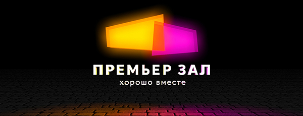
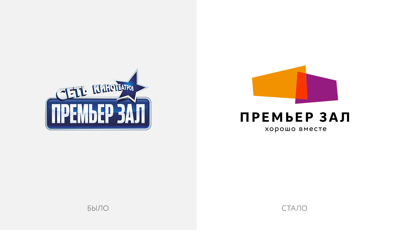
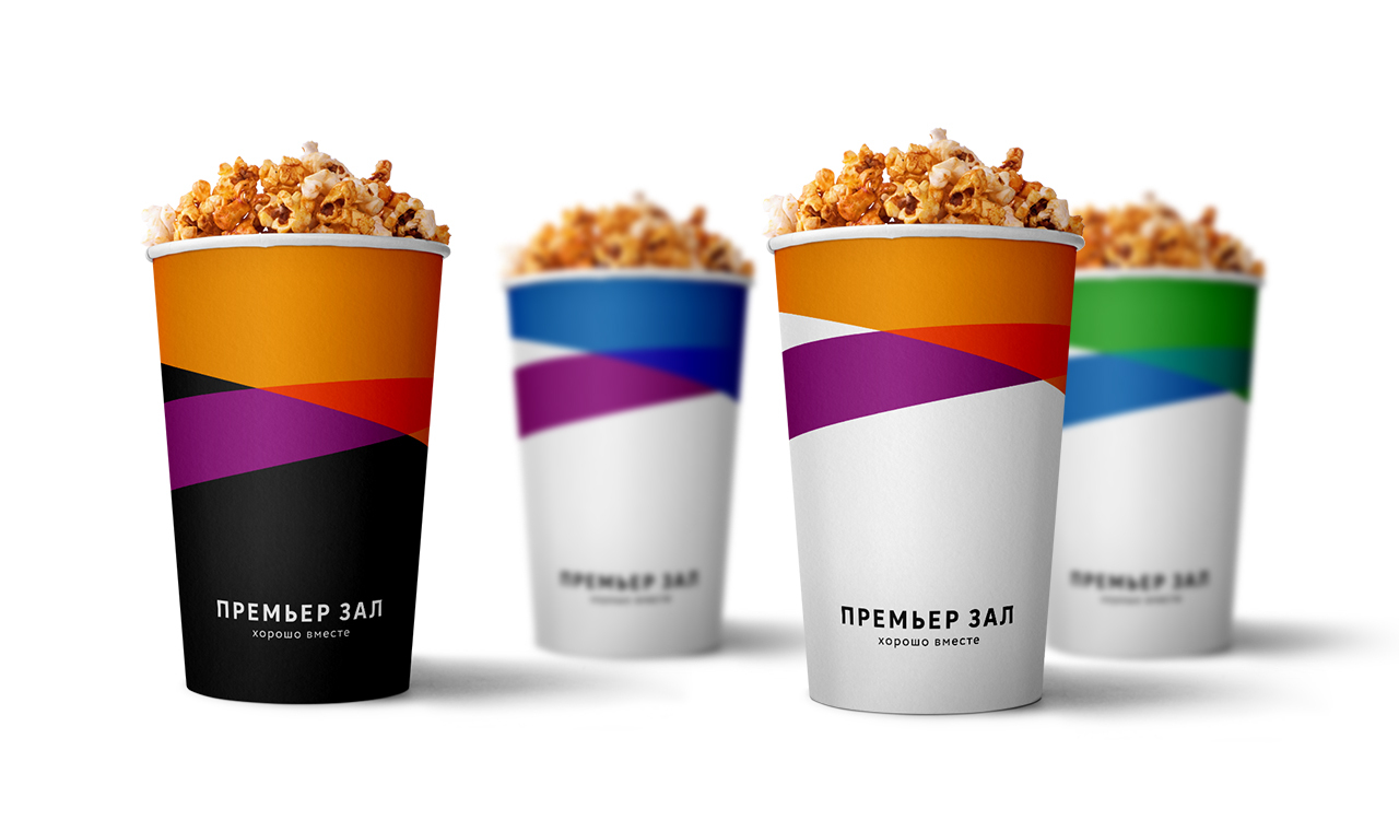
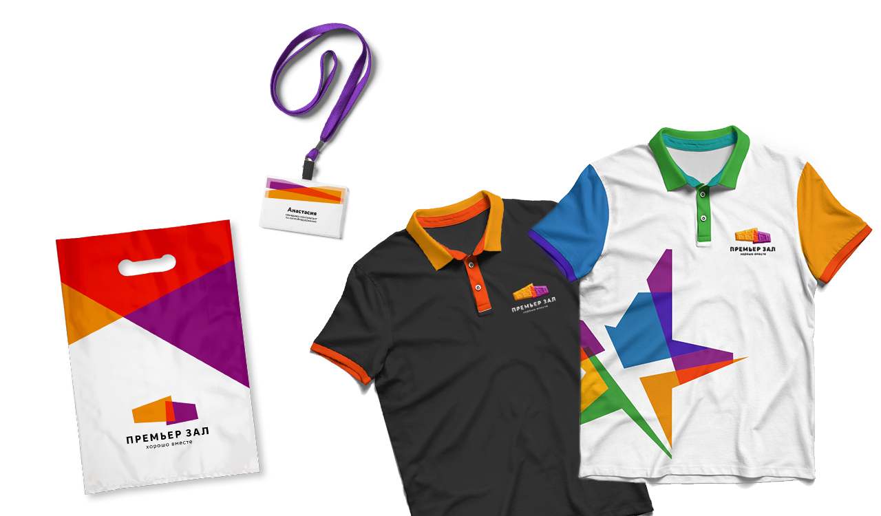
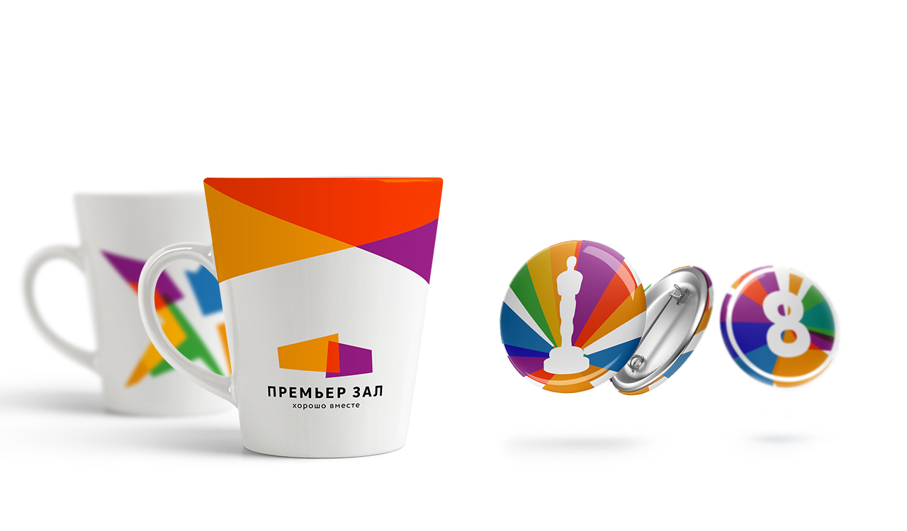
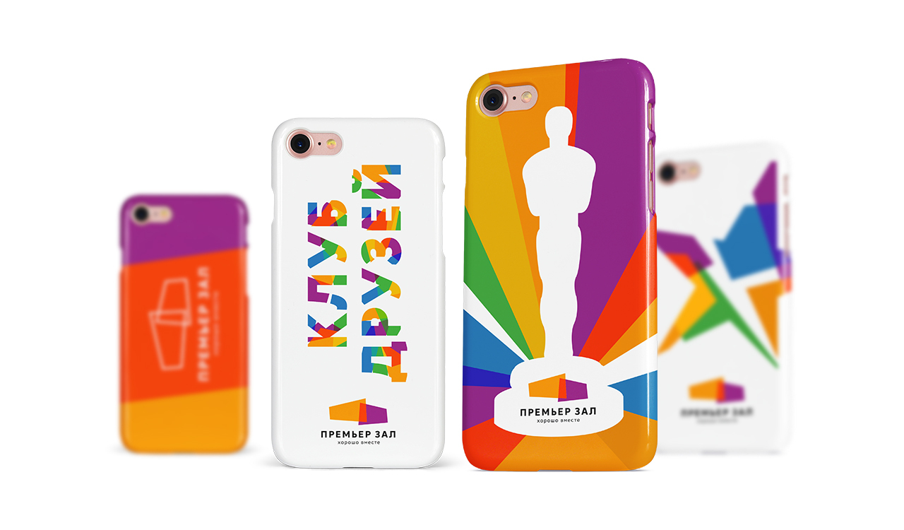
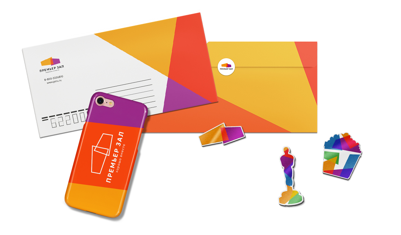
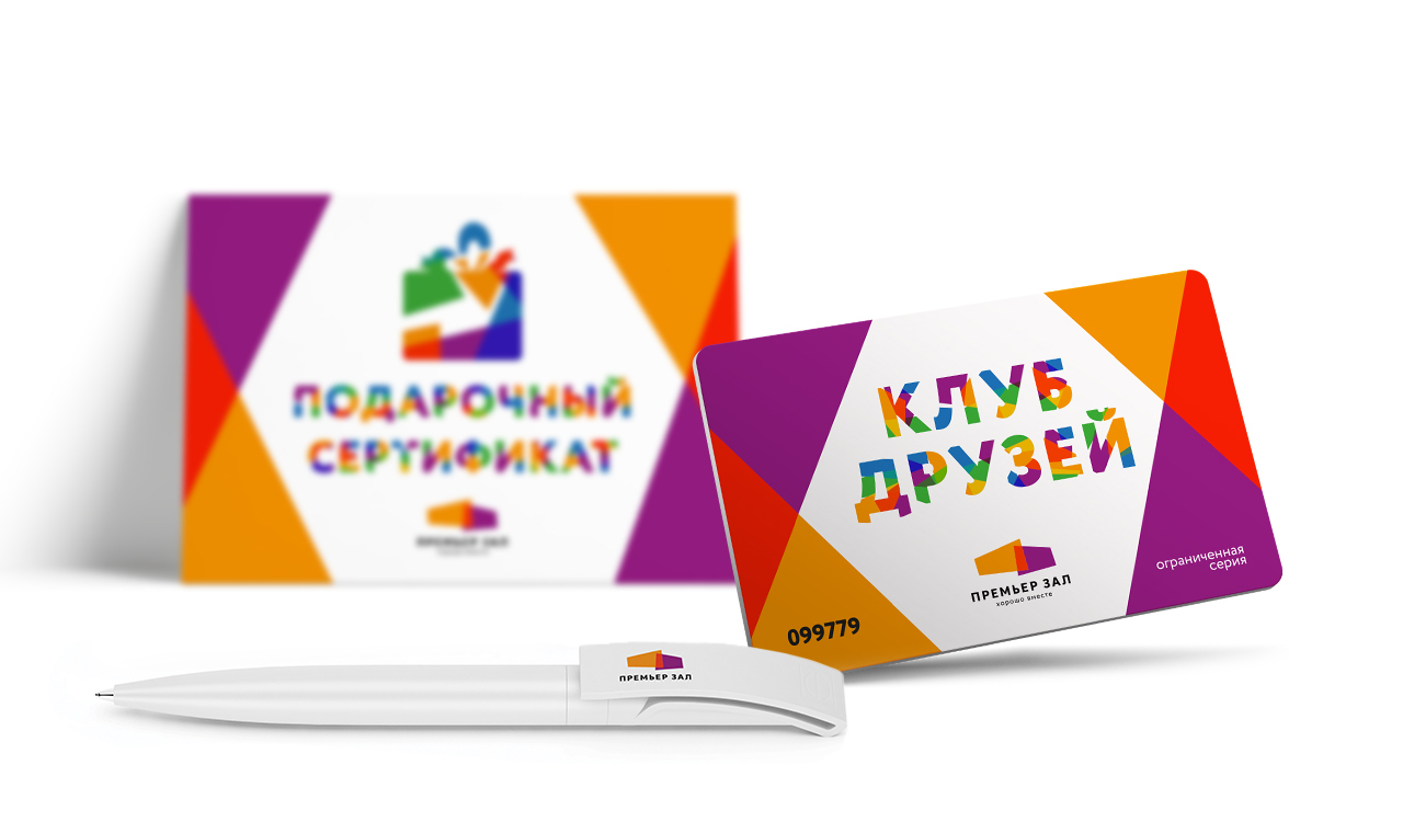
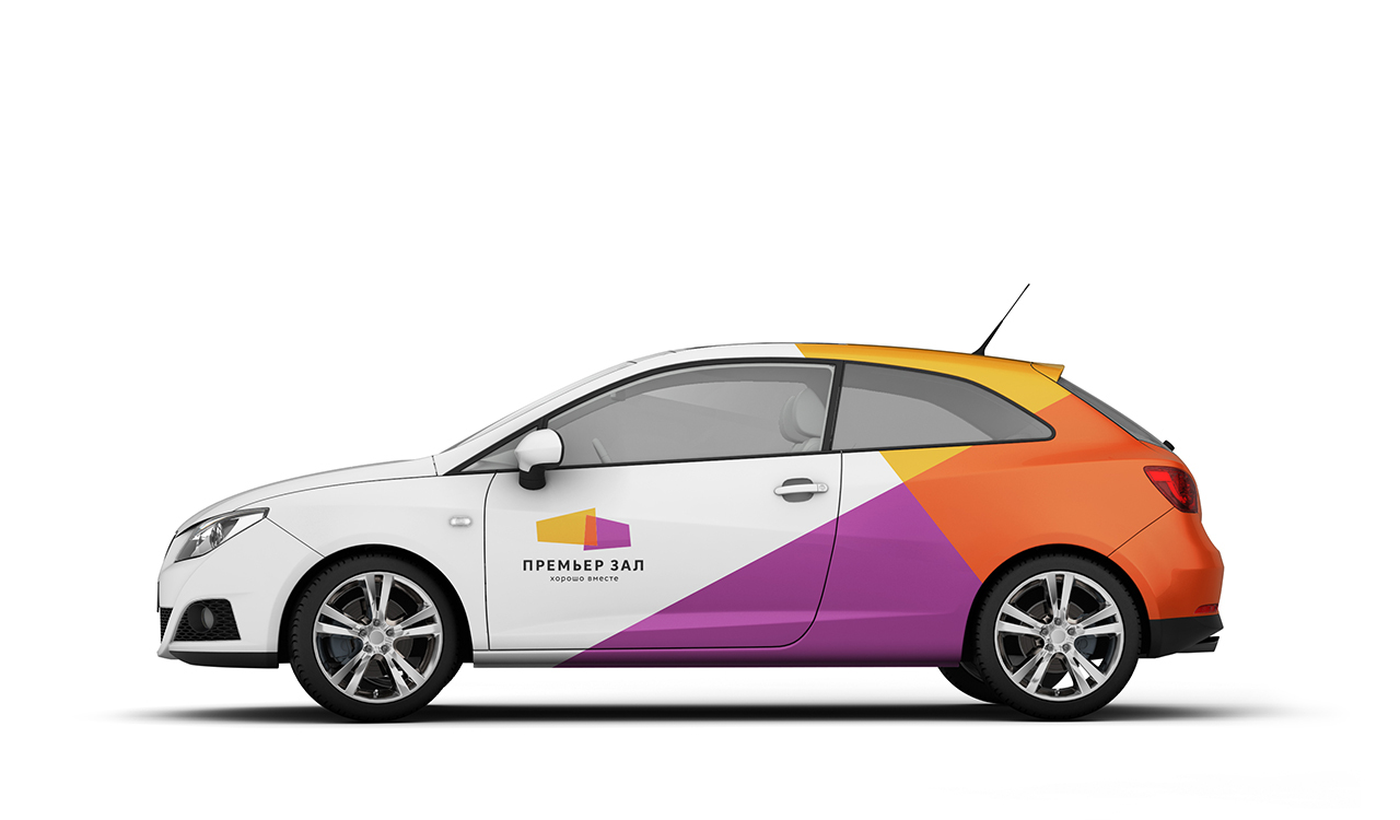
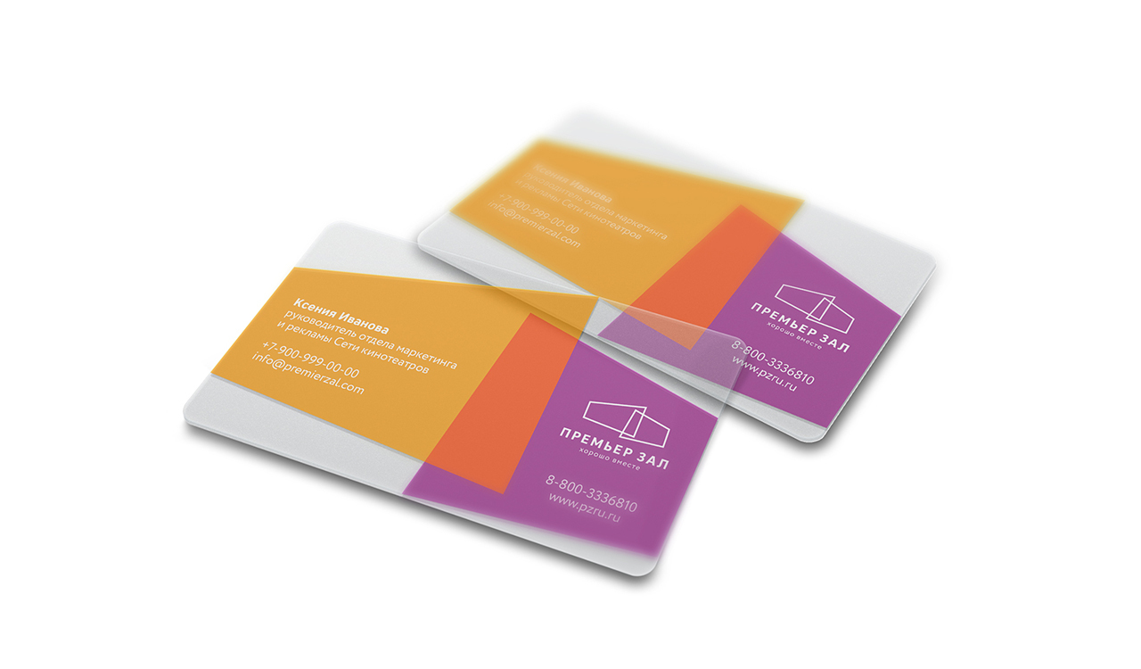
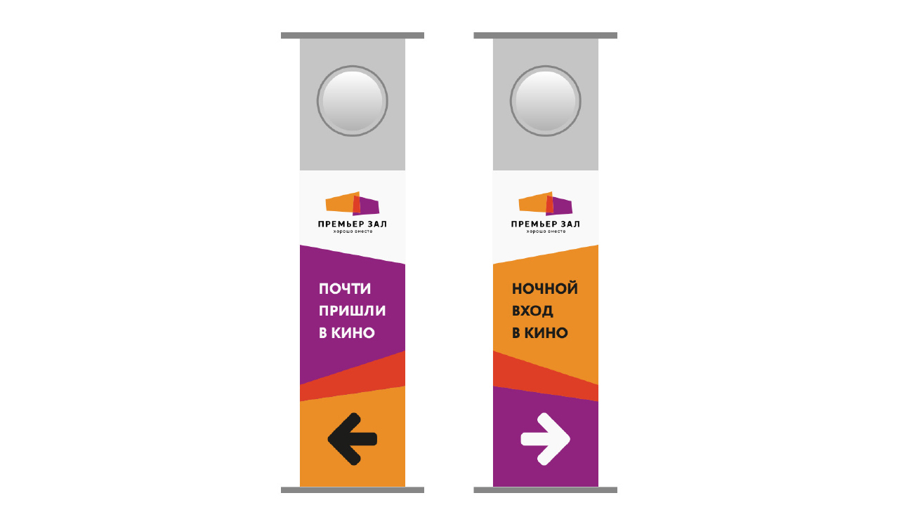
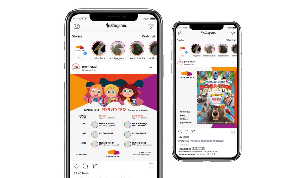
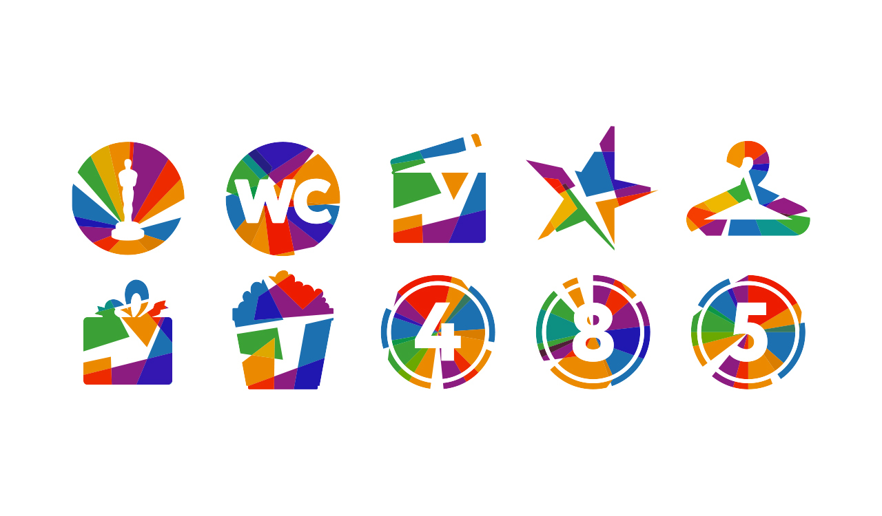
The colored rays of the movie projector intersect in the center make play with the "Good together" descriptor. This solution has a high variability – the resulting planes can be assembled into any symbols. The graphics remain recognizable, but become adaptive. B2B and B2C directions differ in a variety of colors – for working with partners, the identity is based on three basic colors of the logo, and B2C uses a much broader palette.
The new corporate identity turned out to be bright. But at the same time it is quite concise and elegant. It reads several images at once: the space of a cinema, the effect of 3D cinema, the rays of movie projectors and a kaleidoscope. It is easy to remember, and bright colors convey a sense of celebration from going to the cinema.

Segments
Services
All
IT
Low-alcohol
HoReCa
Industry
All
Branding
Marketing
Digital
Packaging
