
LEAVE A REQUEST
Just type your contacts
I agree to the Z&G.Branding Privacy Policy
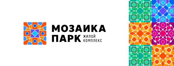
Oil company
Development and extraction of natural resources in the Nenets Autonomous District
Development and extraction of natural resources in the Nenets Autonomous District
The identity of the new joint venture between the two industry giants should reflect the contribution of each while showing respect for the oil production region. Its culture and nature.
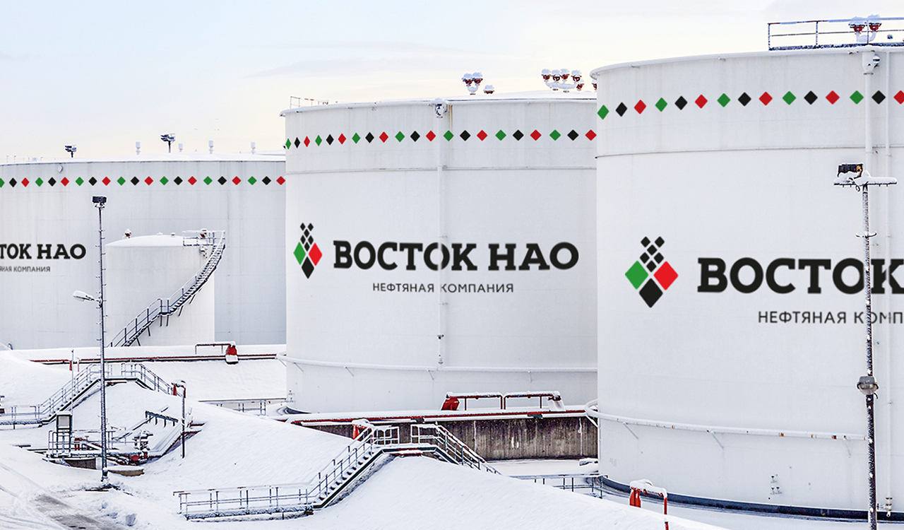
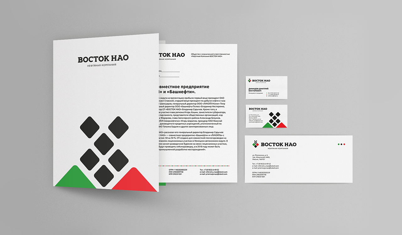
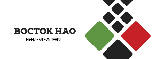
The logo style is based on folk ornaments of the region's indigenous inhabitants. The logo is full of symbolism – a black diamond represents oil deposits deep in the bowels of the earth, which break up in a rapid flow, red and green diamonds – a symbol of the Union of two major corporations. The green color emphasizes the company's commitment to preserving the environment and its environmental obligations. Red is the color of action, courage, and overcoming difficulties in the development of new fields.
Vostok Nao is the courage to develop new fields and achieve economic performance without compromising the environment. The visual solution develops the idea of the logo-symbolism reflected in the style of traditional ornaments. Rhombuses of three corporate colors are used for placing accents. Restrained and symbolic.


Segments
Services
All
IT
Low-alcohol
HoReCa
Industry
All
Branding
Marketing
Digital
Packaging


LEAVE A REQUEST
Just type your contacts
I agree to the Z&G.Branding Privacy Policy
We are open for partnership
Сontact us to get free online appointment.
Сontact us to get free online appointment.


Cities: Ekaterinburg, Moscow, Dusseldorf, San Francisco, London